The London transport network is iconic. Everything from the red double decker bus to the red and blue roundel of the Underground simply screams “London”. So how would you even begin to approach rebranding a significant part of the transportation network without it losing it’s distinctive feel? That’s the problem Transport for London’s team faced after city mayor Sadiq Khan pledged that the London Overground network should get individual line names. That’s right – he called for a full rebranding of the London Overground.
You might be wondering why was there a need for change? Well, the London Overground at present is a sprawling beast made up of multiple amalgamated railway lines serving 131 stations. The network at present sits alongside the various London Underground lines, Docklands Light Railway and the Elizabeth line on the regular Tube map. For those not familiar with the map as it is today, each individual line is represented as a distinct colour exclusive to the line. For example – the Central line is red while the Jubilee line is silver. This basic design concept dates back to when Harry Beck created the first modern tube map in 1933. Beck decided that the tube map should be clear and concise, disregarding physical geography in favour of a simplified diagrammatic layout.
On the modern tube map, the London Overground network is represented as two parallel orange lines sitting alongside the various other lines. With simple lines with few branches (such as the Waterloo and City line), a single line colour works well – making it easy to follow lines from end to end, find interchanges etc. Unfortunately, the Overground service as currently represented on the map has over 10 terminus stations, making the line very difficult to comprehend on paper.
After multiple years of work it was announced earlier this year that the lines had been given new names and new line colours on the map: Liberty, Lioness, Mildmay, Suffragette, Weaver and Windrush. Each of the new lines names were selected in consultation with the general public and carry meaning specific to the areas which they serve (of which, more below).
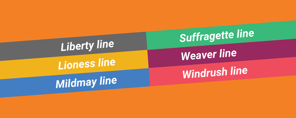
Of course, finding new line names is one thing – finding new colours is another problem altogether. You might think, no big deal, pick something that hasn’t been used already. Well, the tube map at present shows an 17 different services – not including the newly distinct branches of the Overground. Thank goodness it doesn’t show other rail tunnels like the Mail Rail! Take a look at the table below which shows all services on the current map and you’ll see that many of the colours one might just pluck from the sky have already been used
| London Underground lines | Other Services |
| …….. Bakerloo | …….. Docklands Light Railway (DLR) |
| …….. Central | …….. Elizabeth line |
| …….. Circle | …….. London Overground |
| …….. District | …….. London Trams |
| …….. Hammersmith & City | …….. IFS Cablecar |
| …….. Jubilee | …….. Thameslink |
| …….. Metropolitan | |
| …….. Northern | |
| …….. Piccadilly | |
| …….. Victoria | |
| …….. Waterloo & City |
According to an interview by Geoff Marshall with Transport for London’s head of design Jon Hunter, special consideration had to be taken to ensure that the new line colours wouldn’t be confused for another line entirely. In other cases it was important to think about the colours of lines sitting near to the new lines on the map – two different shades of yellow might be very obvious to some people but could blend in to one another for other map users. That’s to say nothing of the fact that various colours look significantly different in print compared to on a sign and again, compared to a screen on ones mobile phone.
In the interview, Jon also noted that while they were giving the lines new colours, it remained important to both TfL and to commuters at large that the London Overground retain it’s strong corporate identity as a network. Primarily, this meant keeping the Overground Orange colour. It will remain a predominant feature of the overground stations themselves with orange roundels on platform signage and of course the orange colouring on the trains remaining.
To the average outsider, of which I’m certainly one, this project may have initially seemed pretty simple – however it’s clear now that it’s been anything but. A great deal of time, energy, and yes – money (an estimated £6.3 million!) has been invested in creating a cohesive brand that at once feels both familiar and yet new. I’m very much looking forward to my next trip to London in order to experience the branding in the wild and see how it impacts my journey. For now though, I’ll live vicariously though this blog post. Below I’ve included some additional information on the new lines – I hope you’ll find it as interesting as I did!


The Liberty Line is the shortest of the current London Overground routes and runs from Romford to Upminster. As well as being the shortest, the line is also is the only London Overground line to intersect with no other overground or underground lines. The line, originally known as the Romford-Upminister Branch Line will be represented on the new tube map as two dark grey parallel lines.
The Liberty line name was chosen to reflect the historic Royal Liberty of Havering. which itself was the inspiration behind the naming of the now London Borough of Havering. Back in the day a Liberty essentially referred to an area where the normal rights belonging to the King (or Queen) had been devolved into local jurisdiction. The Royal Liberty of Havering lasted from 1465 up until 1892!


The current Watford DC Line runs from Watford Junction to Euston. As the new Lioness Line, it will be represented on the map as two golden/orange parallel lines. The new name was chosen to recognize the achievements of the England Women’s National Football team and came hot on the heels of the team winning the Euro 2022 cup.

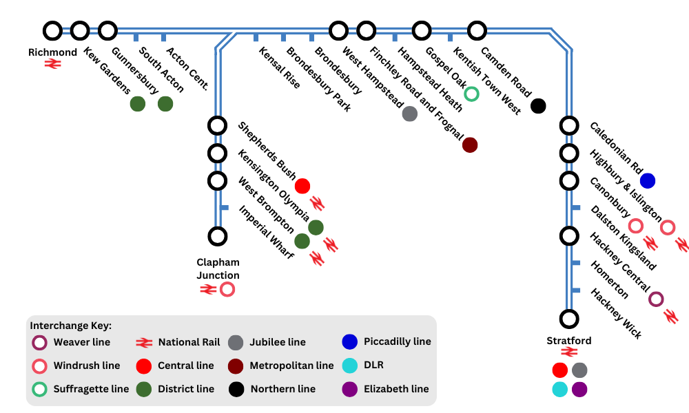
The Mildmay Line runs from Stratford to either Clapham Junction or Richmond and will appear on the map as two parallel blue lines. The line is an amalgamation of the North London and West London lines. The name Mildmay was chosen to honour the work of the Mildmay Hospital which is located in Shoreditch.
Mildmay was an NHS hospital that cared for the poorest members of society in East London. While it closed in 1982, it reopened 6 years later as Europes first hospital for HIV/AIDs patients and was visited by Princess Diana on a number of occasions. Today, Mildmay continues it’s valuable work treating HIV+ patients.


The existing Gospel Oak to Barking line will be renamed as the Suffragette Line and runs from Gospel Oak to Barking Riverside. It is represented on the map as two parallel green lines. The lines new. name was selected in recognition of the longest living suffragette, Annie Huggett, who lived in Barking – passing at the ripe old age of 103. The suffragette movement, of course, was made up of brave women who stood up and demanded the equal right to vote in elections. Following years of struggle, women in the United Kingdom were given the right to vote in 1918, but didn’t gain equal voting rights to men until 1928.

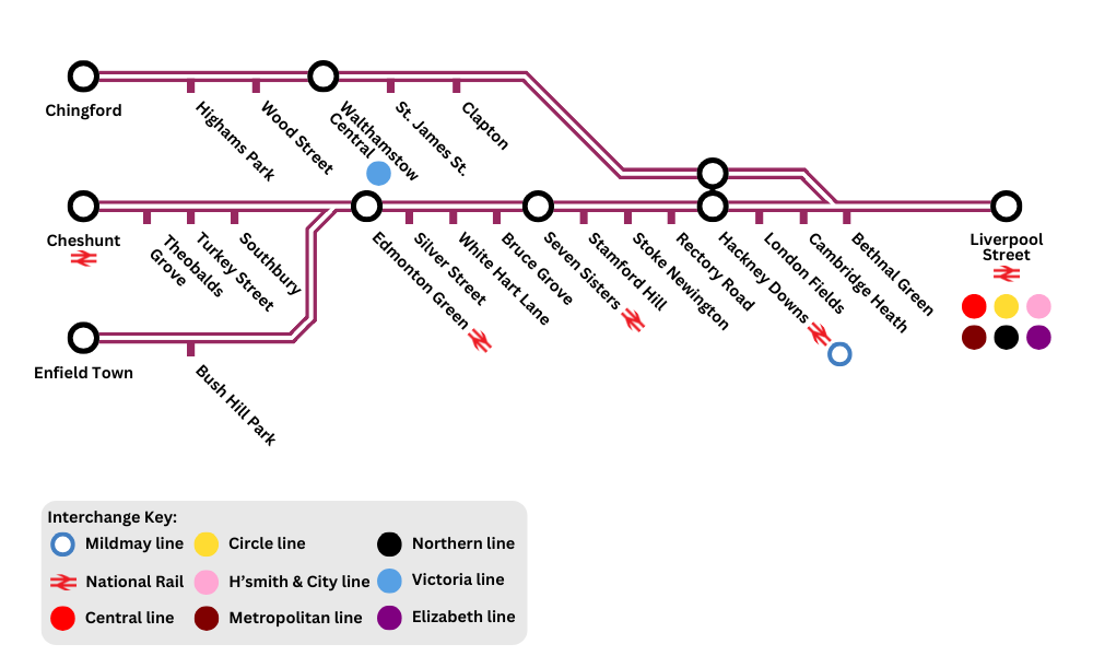
The Weaver Line runs from Liverpool Street to Chingford, Cheshunt and Enfield Town. It is represented on the map by two parallel purple lines. It is made up of the Lea Valley lines. It was named in recognition of the textile trade of the area. The area served by this line has over time served as home for many groups of immigrants, each finding their way in the busting textile industry – from the Huguenot weavers who kicked things off, to Jewish refugees fleeing Germany and many groups in-between.

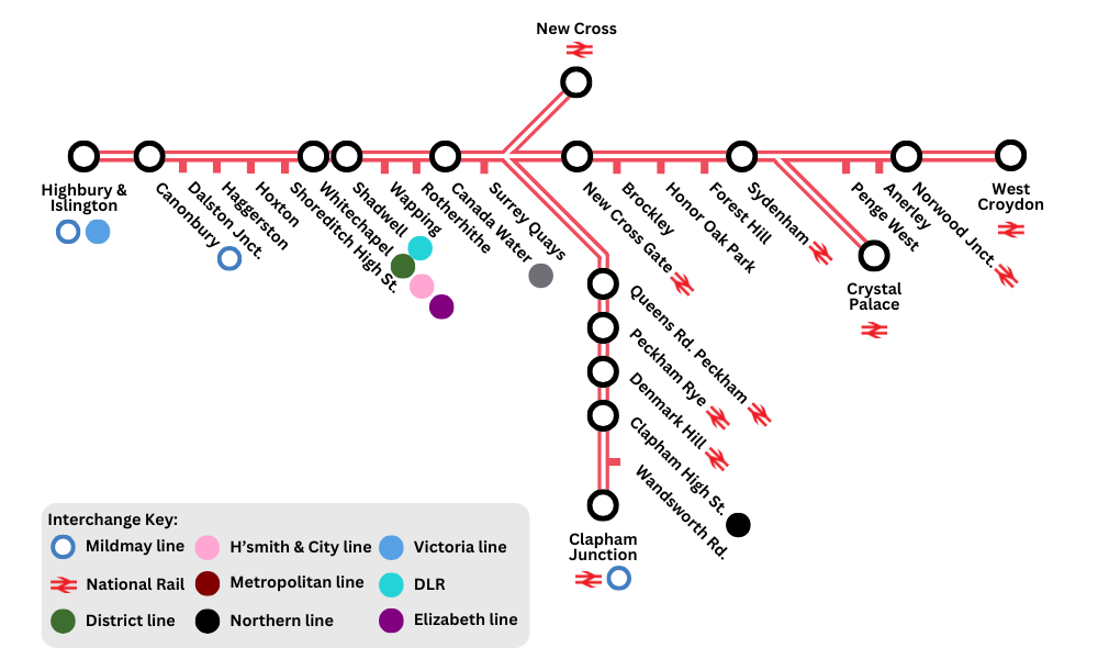
The East and South London lines will become the Windrush Line – running from Highbury and Islington to New Cross, Clapham Junction and West Croydon. It is represented as two red/pink parallel lines. It was named after the Windrush Generation of Caribbean immigrants who came to Britain in the 1940’s and 1950’s and contributed greatly to the rebuilding of Britain following World War II.
Copyright and Maps Disclaimer
TfL don’t allow reproduction of their maps and branding without entering a licensing agreement involving far more money than I have. For that reason, I haven’t included any original maps and the maps presented here are instead mockups I have created for this post. I can’t guarantee that they’re accurate in any way and don’t recommend relying on them for anything other than illustration here.


[…] Update:I went ahead and tried making my own Tube map! You can take a look and read my thoughts…