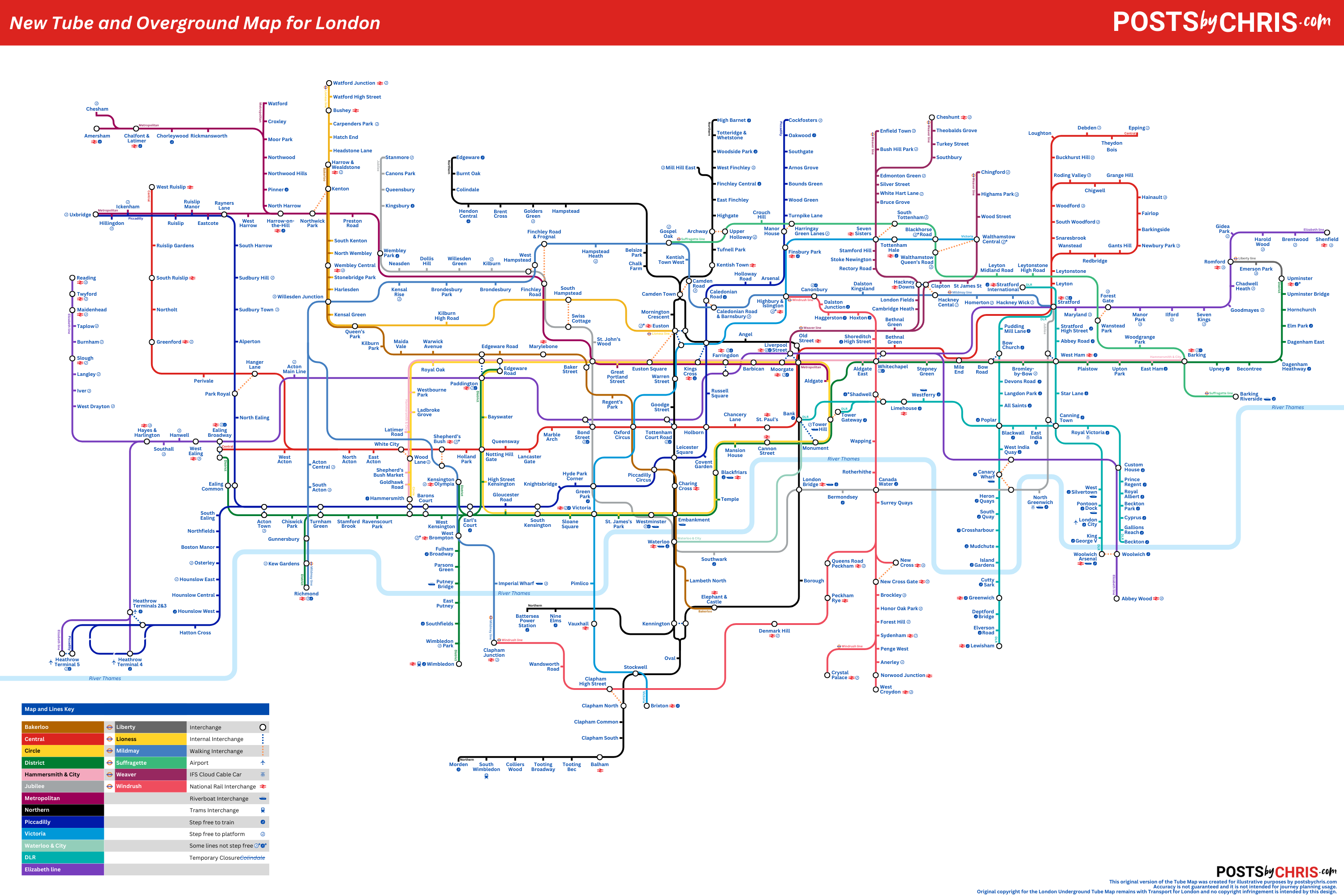
You might remember that about a month back I published my Lessons learned designing my own Tube Map post. Well, apparently one of the lessons that I failed to learn was when to give up on something. If you didn’t read that first post, feel free to take a peek at why I was working on this in the first place. Anyhow, I’m back again. This time I’ve taken the map I created originally and I’ve added the 6 London Overground lines into the mix.
What I came up with
Improvements and Continued Challenges since last time
In my last post I spoke about how the sheer volume of services that the map is trying to represent leads to excessive clutter and confusion. I still feel that this is absolutely the case. Adding in the London Overground network adds a lot of visual noise to an already busy map. That issue is then compounded by the fact that the lines are represented in similar colours to some of the existing London Underground services. On my map, the problem is worsened still by the fact that the software I used didn’t allow for a “hollow” line like the ones used on the official map.
Instead, in an effort to make lines a little easier to follow, I added small labels to the lines at the various starting points of each branch, in the hope that users following a line with their finger would be able to stay on track. While I feel they’re helpful, they do (in some places) seem to add even more clutter to the map, which wasn’t the desired outcome.

Overall, clutter was definitely my biggest issue and became a real problem with adding the new lines to the map. The map is of course already very densely populated, especially in the City Centre itself. Some stations are significant interchanges for other lines and services. One such station is Liverpool Street. On the official London Tube Map you can see that the station is already a tangled mess, and unfortunately I’ve been unable to significantly improve on this as you can see below.

With that being said, there are other areas of the map where I feel I’ve been better able to space things out in a way that still fairly accurately represents the route of a service without unnecessarily complicating the map any further. One example of this would be the way I was able to integrate the Windrush line into the Western end of my map (see below).

Should you make your own Tube Map?
Well, if you’re so inclined to try – I will say that this was a fairly enjoyable project – albeit one that took far longer than I expected it to and kind of highlighted just how difficult it is to create a better version of the original. I’d certainly encourage anyone with an interest in graphic design to take a stab at it, just be prepared to find it an occasionally frustrating experience. I intend to continue to iterate on my map to try and fix some of the bigger issues I’m still having and I’ll certainly be posting updates here when I have them.
Copyright acknowledgement and disclaimer
The current London Underground (Tube) Map is the property of Transport for London.
I do not own, or claim any ownership of their intellectual property.
Any reproduction of their original map here is minimal and falls under, I believe, fair use.
They are included only:
a) to illustrate the commentary being discussed and
b) because there is no free alternative available and a third party reproduction would not suffice to illustrate the points being discussed.
The “New Tube and Overground Map for London” was inspired by the original but created by postsbychris.com. It was built from scratch in Canva.


