I’ve been on a little bit of a transportation kick here on the blog recently. First I wrote about the London Overground rebrand, then about Mail Rail, and most recently I shared some thoughts about the Tube Map getting too complicated. That last one was far and away my most popular post here! Looking at it again really got me thinking more about the map. If it is getting too complicated could I maybe make it better by designing my own Tube Map? As it turns out – sorta. See, my results were a little mixed.
What doesn’t work on the current Tube Map
I went into more details in my blog post, but in brief here’s my main complaints about the current Tube Map (pdf):
- Accessibility icons (somewhat ironically) make the map more difficult to read
- The cable car being shown on the map is unnecessary and adds confusion
- Crowded interchanges are difficult to follow on the map, making connections hard to understand
- Inconsistent spacing between lines makes the map feel cluttered
- Too many services are represented on the map at present making it very crowded
The project
With the above complaints in mind, I sat down at my computer and got to work. I don’t have any professional grade design software (the actual map is likely made in Adobe Illustrator) so instead I made mine in… Canva. Yeah, I know, not the ideal tool. In fact, it was pretty much a limitation of Canva that led to my design eliminating diagonal lines!
Not really knowing where to start, I opened a 3000×3000 blank canvas and gave myself a two-week timeline to create something. I initially started by plotting out the Central Line. Why the Central? Well, it sits pretty centrally on the map and interchanges with nearly every other line so it seemed like a good start. Next I worked on completing the DLR, Circle and Hammersmith & City lines. The DLR because it mostly sits out to the East without meeting many other lines and the Circle and H&S lines due to their orbital nature. Finally, I started adding lines as and when they interchanged with one of the other lines I’d already worked on.
Building out the map was fairly simple for the most part, with most lines largely consisting of fairly straight lines. Outside of the city centre, that is. Central London was more challenging with it’s many intersecting lines and complicated station interchanges. One thing I didn’t really account for was simply how many stations actually interchange with National Rail and Overground services.
What I came up with
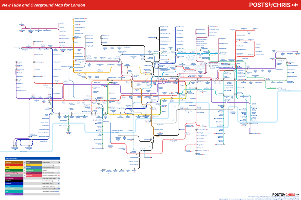
After a lot of work (but still probably not enough), I came up with what you see below. I’m cheekily calling it “New Tube Map for London” in honour of the “New Tube for London“. Really though, ti deserve that name it needs a lot more work!
The map features all of the London Underground lines, the DLR and the Elizabeth line. If you’re interested, you can download a PDF or PNG copy of the map below.
What worked

One of the first changes I made was to move the accessibility icons off of the lines themselves. Instead I added them as an icon next to the station names. I feel that the lines feel less cluttered and there’s less confusion regarding which stations are interchanges. With that being said, in tighter areas of the map the icons do add some crowding around the station names. That’s something I’d like to address if I make a newer version of the map in future though I’m not yet sure how.

I also went ahead and removed the IFS Cloud Cable Car from the map. It’s addition was odd and frankly confusing – not least due to the fact that no-one really uses it. I found it blended in with similar looking lines such as the DLR and the Elizabeth line and was distracting from those services. So, I removed it. Instead I added a cable car icon to the stations at both North Greenwich and Royal Victoria. This is similar to how the Riverboat services and airport interchanges are shown on the map at present. In doing this the service is still represented but in a more measured way that doesn’t give it undue prominence on the map.
What didn’t work so well

Something I had struggled with was the complicated and confusing nature of some interchanges on the current map. The reason that Euston in the example above has so many arms is complicated. There’s a need to show two separate branches of the Northern line as well as an interchange with the Victoria line, the Overground and a walking interchange with Euston Square. There’s also an accessibility icon on one of the branches and some unnecessary spacing between lines.
I had really wanted to completely eliminate the need for multiple arms but it wasn’t possible if I still wanted to accurately show the lines layout. Instead, I was able to make some changes to make the presentation a little cleaner and easier to follow. As you can see below, I eliminated the Overground from my version of the Tube Map. I also changed the “linked interchange” symbol to a narrow dotted line – with different colours denoting same-station interchange and out-of-station interchanges respectively. I found this added some much needed white space. Finally, I brought the lines within “touching distance” to eliminate some of additional the visual clutter.

The existing Tube map shows a huge variety of services. It shows the Underground lines, DLR, Elizabeth line, the Overground, Thameslink and the trams. Frankly, that’s too much. In an attempt to be truly comprehensive, the map instead become overly complicated. On my map I made the decision to remove Thameslink services and the Trams. While both are important commuter links, they are niche compared to the rest of the network. Thameslink is also a sprawling network that at present is represented in only one colour on the Tube map and really needs breaking down in a similar manner to the London Overground.
Speaking of the London Overground… I also took it out. TfL did a great job differentiating the lines as part of the recent rebrand but they still add a huge amount of complexity to the Tube map. Really, I think they’d be better suited to appearing on a dedicated “Tube and Rail services” map, which TfL already make a version of themselves (and trust me, it’s a LOT to absorb). Instead on my map I simply denoted Overground interchanges with the appropriate symbol.

So what did I learn from all this?
Well, firstly it turns out that building the Tube map is actually quite a lot of work! Building the fairly limited and amateurish version of the map in this post probably took me north of 18 hours over a period of a couple of weeks. Realistically, for me to go through and now find every minor mistake and correct them would add another 6 hours at least. That’s not even considering that there are additions I’d like to make!
They say that less is more – and they’re right! While the original map absolutely is overly complex, it’s become that way over a great deal of time as more stations and lines have been added to the system. It’s had to keep up with new modes of transport (hello Elizabeth line) and new stations (howdy Battersea Power Station). It’s also tried it’s best to provide huge amounts of information in a presentable way – river services, accessibility information, trams, airports and heck even air conditioning are all denoted on the current map. Deciding what should and shouldn’t be on the map was a difficult balancing act – and I don’t even have any skin in the game!
Geographical consideration was also a challenge. Obviously the tube map isn’t super accurate as is, but I felt it important to not completely skew things out of all proportion. This was difficult as by trying to space things out a little and simplify the map, I found some of the lines were drifting way off course. Case in point, I had Cockfosters way South of the eastern Central Line at one point.
The folks in charge of this stuff over at TfL clearly have their work cut out. While I doubt that any of them read my original post, I hope that if they did they’ll understand that I came from a place of looking for simplification, and not a place of criticism for the sake of it. Now that I’ve had my own little go at things, I can see what a mammoth task it is to even squeeze one more station onto the map, let alone improve readability for millions of users! It will be really interesting to see how they continue to evolve the map in the coming years.
If you have any thoughts about what you’d change on your own tube map, let me know by leaving a comment below!
Copyright acknowledgement and disclaimer
The current London Underground (Tube) Map is the property of Transport for London.
I do not own, or claim any ownership of their intellectual property.
Any reproductions of their original map here is minimal and falls under, I believe, fair use.
They are included only:
a) to illustrate the commentary being discussed and
b) because there is no free alternative available and a third party reproduction would not suffice to illustrate the points being discussed.
The “New Tube Map for London” was inspired by the original but created by postsbychris.com. It was built from scratch in Canva.


One Comment
Comments are closed.