Note: The work on this branding exercise was done prior to the soft launch of Great British Railways this past weekend. Clearly great minds think alike.
Britain is currently in the process of renationalizing it’s railways. At present individual branches of the network are operated under a franchise system. This means that individual companies are responsible for the day to day operation of train services within their franchise. It also means that from one line to the next – trains, signage and branding can all look very different. Over the next couple of years the Government intends to bring these franchises back into public ownership. This started with the South Western franchise a few days ago. The combined network will be known as “Great British Railways”, harking back to the days of British Rail. While this is a great opportunity for the rail network, it’s also a great opportunity for new unified and strong brand.
With this in mind and more time on my hands than normal, I figured I’d take a quick poke at things. As a relative amateur, I took a look at some of the existing branding in use on the network and tried to throw together a new brand image for GBR. My aim was simply to create something new that felt familiar at the same time.
Branding Inspiration
In creating my new branding concept, I took a few moments to consider what represented my two focus areas the best. Those areas were British and Railways. I imagine that went without saying, really.
The “Double Arrow”
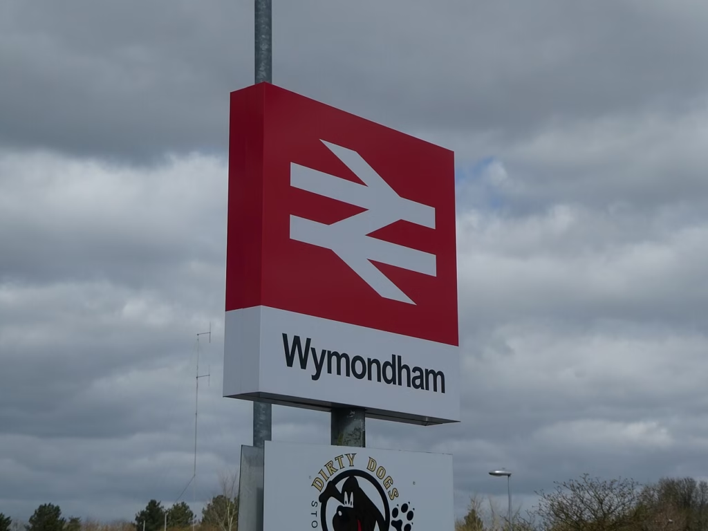
One of the most common sights on the UK’s national rail network is the Double Arrow logo (seen below). It was first introduced as the logo for British Rail in 1965 and has since come to represent rail services nationwide. The logo appears on everything from station signage to maps and tickets. It is ubiquitous with the rail network as a whole. Typically the logo appears either as a red symbol on a white background, or a white symbol on a red background. With the logo being such an icon, I knew it needed to be part of any new design.
The Union Flag
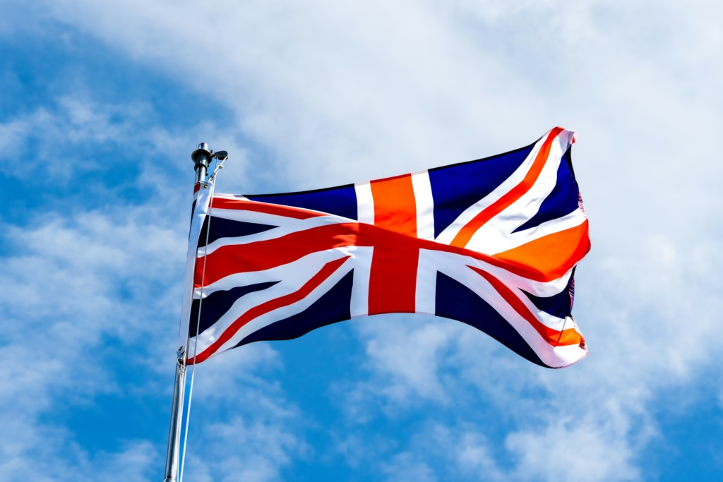
Needing no introduction is the Union Flag. There are few things that scream “British” quite like the red white and blue. It’s appeared pretty much everywhere from mugs to novelty underwear and on everything in between. The idea of a new rail company called “Great British Railways” not somehow integrating the colour scheme into their brand identity was unthinkable.
The “Britain is Great” Campaign
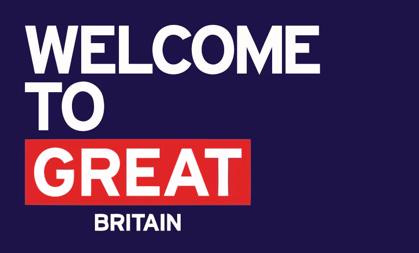
Finally, the “Britain is Great” campaign was a Government initiative to draw tourists and businesses to the UK. The branding was pretty distinct for it’s simple design, use of large bold text and visual highlighting of the word “great”. Additionally, it took inspiration from the colours of the Union Flag. Less is sometimes more in branding and this campaign has always stuck out to me for that reason.
New Branding Concept
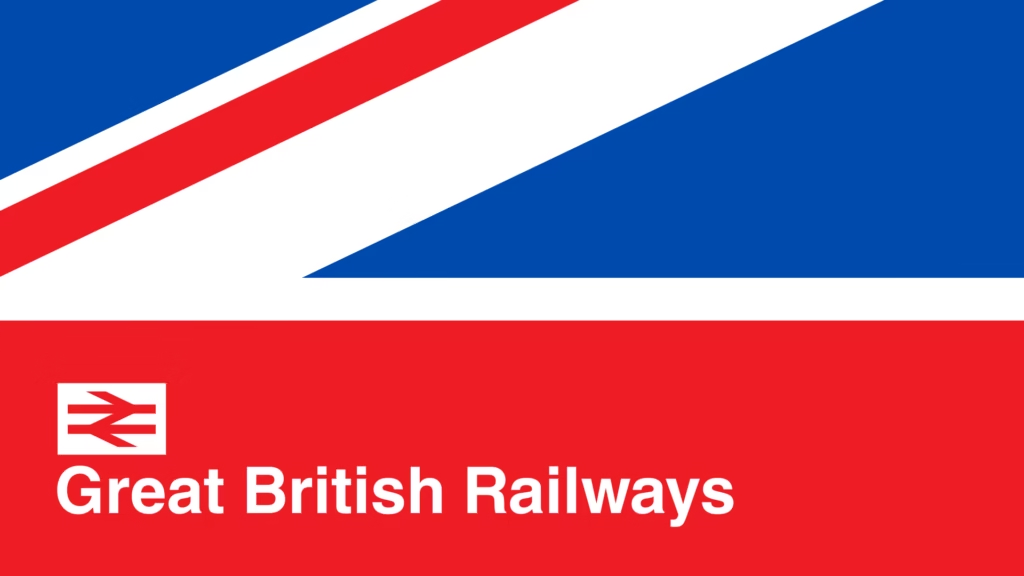
Taking everything into account, I knew that I could use elements of my inspiration to meet my goals. A couple of hours of poking around in Canva later, I have a very basic concept.
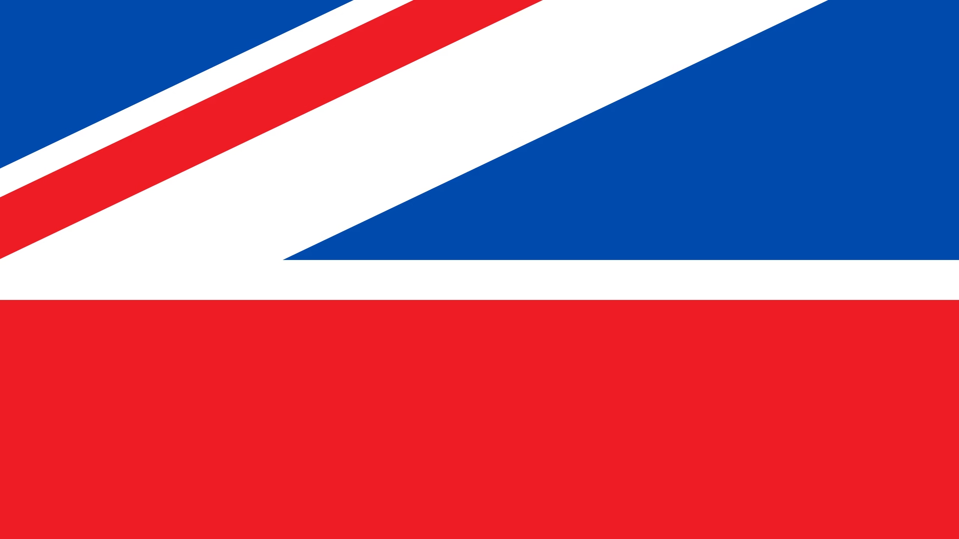
I first took the Union Flag as key inspiration, ensuring the design would be undeniably British. Choosing to adjust the colouring slightly, I opted to colour-match the red to the original British Rail hue. I also chose to use a brighter blue as I felt it a little more distinctive versus other branding. The diagonal slash is again inspired by the flag but kept to the far left of the signage. I intended this to complement the arrows found in the “double-arrow” logo and invoke a sense of direction.
Speaking of the double-arrow logo, nothing says railway like the it does. It remains part of my new branding concept, proudly sitting above the route name. I chose to place the symbol within a negative-space box to make it a distinct and separate part of the brand. In this way, I feel it’s similar to the standalone double-arrow signage outside stations.
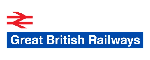
Obviously full colour branding works better in some places than others. For situations where it’s not appropriate, such as printed materials, I opted for a slightly more restrained approach. I stuck with the original red “double-arrow” while still employing the royal blue and white in the design.
Finally, with the double-arrow being such a strong icon in it’s own right along with the colour scheme, I feel it unimportant to always include the Great British Railways wording. Instead, I’ll replace it with the individual line name for each service. I feel that with time, customers would come to recognize these lines as part of GBR.

How it might look in the real world
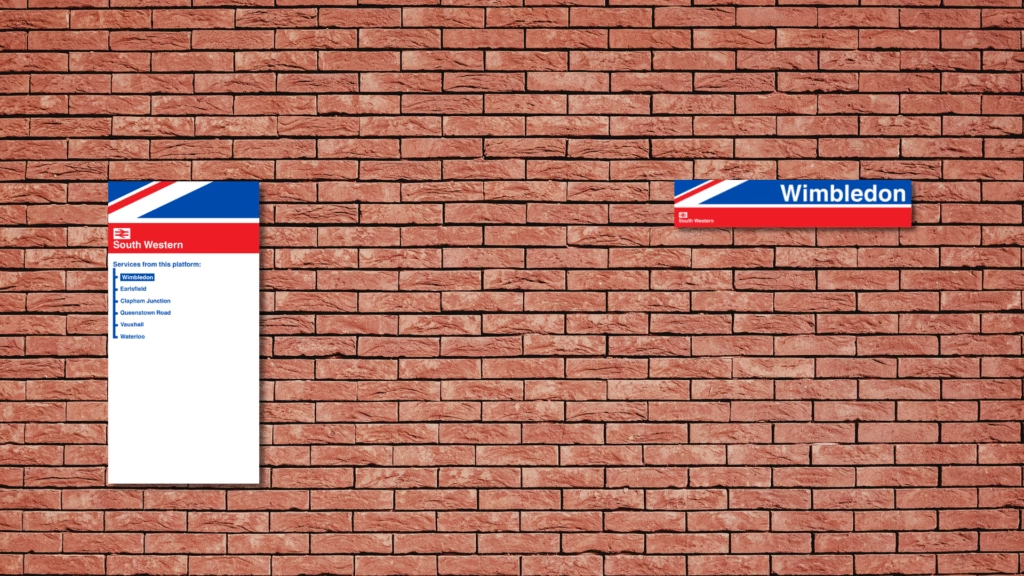
The real test of a design isn’t how it looks on screen, it’s how it looks in the real world. I applied the design concept to a couple of the more mundane aspects of the network – a station nameplate and route signage. I was pleasantly surprised with how the signage looks in a mock-real situation. The station name plate is bold and distinctive and immediately identifiable as a Great British Railways property.
Unfortunately, I lack the many millions of pounds it would cost to roll out that signage across a rail network as a test. Instead you’ll have to do your best to imagine the picture below is real.

To sum up
I’m obviously not seriously suggesting that my concept is better than whatever the UK’s Department of Transport come up with. Instead, this was a fun exercise in branding for someone who doesn’t really know what they’re doing. Hopefully when the time comes GBR will launch with a distinct brand identity that graces British railways for decades to come. In the mean time, I’m going to keep playing with my concept – maybe there’s something in it after all.


