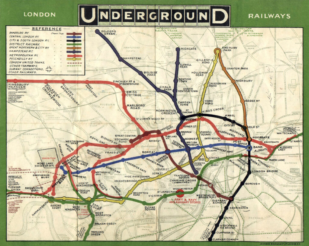
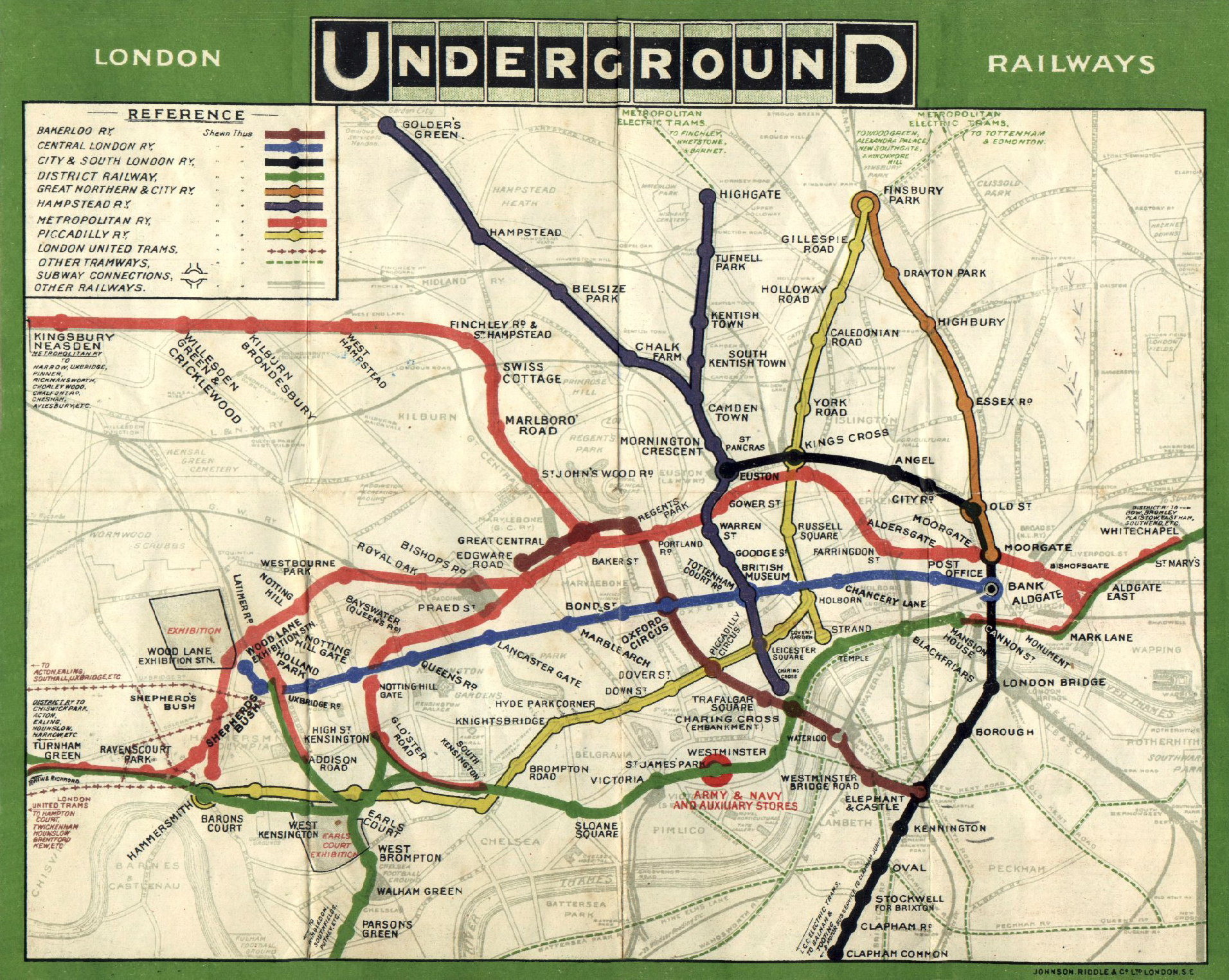
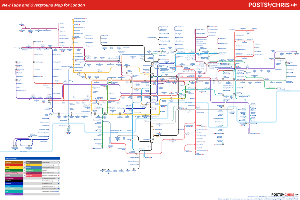
The Tube Map is an undisputed icon. It’s been around for so long that it’s story has become a thing of legend among Londoners. For those who don’t know, I’ll keep it brief. When the Underground first became a unified network the map was a sprawling mess of lines laid out over a street map of London. The map as we now know it didn’t come about until 1931 when Underground employee Harry Beck first attempted to simplify it. Beck realized that with lines running underground there was little need for a map to be geographically accurate. He instead laid the lines out similarly to an electrical diagram. The map had clean, straight lines and clearly indicated interchange points. Despite London Underground initially being skeptical of the design, it was launched in 1933. The map proved immediately popular and since then the Tube Map has followed Beck’s guiding principles in one form or another. With 17 lines now represented instead of the original 8 – I find myself wondering, is the Tube Map too complicated? I’m willing to say it is. Here’s my thoughts on some areas of concern and what could change to simplify it.

Accessibility Icons

Transport for London have been working for many years to improve accessibility on the aging network. For several years these accessible stations have been highlighted on the tube map. White wheelchairs on a blue background indicate step free access from “street to train”. Blue wheelchairs on a white background indicate step free access from “street to platform”. These were initially a useful and important addition to the map. However: 92 tube stations, 60 overground stations, all Elizabeth line and DLR stations are now step-free. As a result, there’s a lot of these icons on the map. So many, in fact, that I think it’s beginning to cause confusion with the very similar interchange symbol and certainly some visual clutter. I actually find the icons really visually disturb the flow when following a line with say, your finger, in crowded segments of the map.
Proposed simplification:
While there is a dedicated map for step free access, I do think it’s important to maintain visibility of step-free access on the main map. At least, that is, until the network is completely accessible. I’d propose a change similar to the diagram below. I’d remove the current on-line icon and move it to the end of the station name. I’d also make the icon smaller. Colours and their meanings could be maintained with an explanation still provided in the map key. By making these changes, it would significantly reduce visual clutter on the map.

Air Conditioned Trains

A relatively new addition, snowflakes now appear next to the line names in the line key indicating which services currently offer air conditioned trains. I do find myself wondering how useful this information actually is. With certain lines being the only option to reach certain destinations, it’s not as though users can exclusively use air conditioned trains to reach every point in the network. In fact, the cynic in me wonders if TfL might have added this to the map to quiet critics of how hot the tube can actually be. Regardless of why they’re there, the addition of these symbols on a crowded map full of icons is an unnecessary complication.
Proposed simplification:
This is probably the easiest one on this list – I would simply remove the symbols. I’m not sure if there are users who actually use this information but I’m sure that those needing it would be able to search for the information. It could be, and probably is, listed on the TfL website.
Cable Car

The London Cable Car, or IFS Cloud Cable Car for branding purposes, opened in 2012. Originally known as the Emirates Airline, it’s appeared on the tube map since opening for service. This is despite only having 4 regular weekday users in 2013! TfL really seem to want travellers to consider the cable car as a viable commuter route but as Jago Hazzard points out in his video – it just isn’t. Sitting on the map straddling the Thames, it’s presented as a viable link between two other lines but just isn’t.
Proposed simplification:
The IFS Cloud Cable Car doesn’t directly interchange with stations at either end. Instead, it’s connections are walking interchanges. Given that the route really isn’t a commuter service (no matter how much TfL want it to be), I don’t feel that the cable car warrants any more than a small symbol next to the station names it connects near to. Think of this as being similar to the Airport and River service icons that already appear on the map elsewhere.

Crowded Interchanges

Interchanges on the network used to be illustrated with a simple circle, but in recent years they’ve been becoming more and more complicated. There are several factors impacting this. First is the need to make sure branches of the same line are visibly separate, even when running through the same station. Then there’s the need to show that some lines (but not necessarily all) at the station are step-free. Then finally, TfL also show out of station interchanges where passengers can walk a short distance to other nearby services. All of this adds up to abnormally large “blobs” on the map that cause visual distraction and cause other elements on the map to become cramped and more confusing.
Proposed simplification:
There are several things that could be done to simplify the appearance of interchanges. First, there should be a design standard to limit interchanges to a maximum of two interconnected circles on the map for simplicity sake. Secondly, as proposed above, accessibility indicators should move to the station name and off the line diagram. Euston station at present has a whole extra “arm” on the interchange to accommodate that accessibility symbol. Third, out of station indicators (the dotted line seen above) should be made significantly more discreet as to not cause confusion with the similar looking lines. As you can see in my example below, these changes vastly simplify the look of the interchange.

Mind the Gap

Older versions of the Tube Map used to show services that share a route, or the same tracks, directly parallel to one another. In a decision that seems to flip flop every few years (I’m not able to confirm exactly when), this was changed on certain sections. Instead, the lines run parallel with a small gap in-between. This again risks confusion as there are already several lines on the map represented by two coloured lines with a white gap separating them. For example, the DLR and overground services appear such. It also visually takes up more room on the map (albeit, not much more).
Proposed simplification:
I would suggest reversing the change to once again show the lines directly parallel to one another, which more accurately represents the actual reality of the service. It still accurately shows the ability to exit at each station on the route from either line. Of course, the “express” service of the Metropolitan line isn’t represented on the tube map at present, but that’s a whole other conversation.

Thameslink and the Trams

Thameslink is another relatively recent addition to the map – though again, I’m not able to pinpoint exactly when the change occurred. My biggest complaint with it’s inclusion is that the entire route and all of it’s branches are displayed in the exact same way. This has lead to a sprawling mess of identically coloured lines that is difficult to follow unless you’re already familiar with the service. The addition of tramlink has caused a similar, though less serious, concern. This is clearly a problem that has been identified before on other lines – heck, TfL literally just rebranded the London Overground lines due to this.
Proposed simplification:
The tram network exists in a part of London with little tube connectivity and I think warrants continued inclusion on the tube map. However, Thameslink is too broad of a network to warrant inclusion in it’s current state. It causes a lot of visual clutter, and with clutter comes confusion. It’s also, truthfully, not actually part of the network in the same way that the Underground, Overground, DLR and Elizabeth line are. Instead, it should be removed from the tube map, but left in place on the Tube and National Rail services map. By doing this the information is still available to those who really need it while removing visual clutter for those who don’t
In Conclusion
Harry Beck’s design truly continues to be a timeless classic. No-one has yet found a manner of displaying the network in a way that makes more sense of a complicated system. With that said, there’s room for TfL to improve. I’m not an expert on design but feel my proposals above could be a small start to positive change. I’d love to see TfL invest some real time and money in improving the map. Whether that’s simply working on design changes, or consulting with the public see what they need – action should be taken. London’s tube and rail network will continue to grow and setting new standards today will keep the map relevant for decades to come.
Update:
I went ahead and tried making my own Tube map! You can take a look and read my thoughts on the lessons learned here.
Copyright acknowledgement and disclaimer
The current London Underground (Tube) Map is the property of Transport for London.
I do not own, or claim any ownership of their intellectual property.
Any reproductions of their map here is minimal and fall under, I believe, fair use.
They are included only to:
a) illustrate the commentary being discussed and
b) there is no free alternative available and a third party reproduction would not suffice to illustrate the points being discussed.
The London Underground (Tube) Map from 1908 is considered to be available in the Public Domain.
The proposed line diagram changes were all created by postsbychris.com


[…] Update:I went ahead and tried making my own Tube map! You can take a look and read my thoughts…